Judging Books by Their Covers

What’s the phrase? “Don’t judge a book by its cover”? If you’re speaking metaphorically of people as books then yes, I wholeheartedly agree. Let’s not stereotype, reduce people to clichés, or otherwise pre-judge experiences with our fellow books… er… people. But if we’re speaking of actual books, or CDs, or new plays in the 2018 Minnesota Fringe Festival then covers are about 80% of what we know about a piece before we take the plunge into spending an hour of our lives with it. And (in the context of picking Fringe shows) I don’t think this is a bad thing. In fact I think the show title, cover art, and show description are opportunities for detail-oriented producers to captivate potential viewers. When done well, the ‘cover’ introduces the viewer to a production’s style and gets the viewer in the right mindset for what they’re about to see. When done poorly, the ‘cover’ sets up an expectation contrary to the show and leaves the viewer feeling disappointed that its implicit promise wasn’t fulfilled.
So this year I did it. I defied my Kindergarten teacher and chose 4 shows purely by their covers (I also ran with scissors but that’s another story).
Bits & Bobs: An Evening of Short Plays

Why did I choose this cover?
100% for the cover art. This image of a young woman flying (or falling), dressed in a birdlike print, and typing in her temporary suspension is gorgeous. It has an urgency and a surrealism that I find captivating.
What did this cover imply?
Sitting in my seat at Theatre in the Round I wrote that (based on the cover) I was expecting; youth, mayhem, creativity bursting forth in a way that can scarcely be contained. A fearless, modern show.
Did the cover deliver on its promise?
No. About five minutes in I realized the cover had nothing at all to do with the show I was seeing. I subsequently spent the next five minutes distracted from the action onstage and recalibrated my expectation for the evening. In truth, the show was a collection of short pieces written (not by a flying 17 year-old) but by two local writers with impressive résumés. Within 60 minutes, this show presents five separate short plays ranging from comedic to dramatic to generally absurd. The six actors wear many literal and figurative hats to present so many stories in such a short time. The writing of Kevin Bowen (and M. Scott Taulman for one piece) is good and squarely in the theatrical style of Neil Simon. I love Neil Simon. “The Odd Couple”, “Barefoot in the Park”, COME ON! These are theatrical masterpieces that start slow and (over the course of 90 minutes) show us that the spoken words are only half of what’s happening on stage… Oscar and Felix say they hate each other but they’d be lost on their own. This patient writing style demands time to bloom and one Fringe hour (let alone five plays inside of one Fringe hour) isn’t enough time to really get to know these beautiful characters. There were gorgeous moments in “Bits & Bobs” but the show feels more like theatrical show & tell than a compelling evening.

Why did I choose this cover?
Max Wojtanowicz. Max has run ‘Musical Mondays’ forever and has become the poster-child for musical theater in Minneapolis. Also, the promise of seeing real-life couples sing songs about their real-life fights is too good to pass up. (after seeing the show I learned that ‘Couple Fights’ has been a consistent Fringe participant for 4 years running but it was brand new to me)
What did this cover imply?
Before the opening number I wrote: Relatable, commonplace situations (that are usually socially taboo) get talked about with humor and directness. All exaggerated by the spectacle of musical theater.
Did the cover deliver on its promise?
ABSOLUTELY YES! Mostly banal situations such as; trying a new dance move, breaking a favorite pint glass, or choosing between Law & Order and Lord of the Rings were turned into beautiful scenes. Between the group opening and closing numbers there were eight freestanding songs, each of which was both surface-level fun and also profound in that we see the ‘before’ and the ‘after’ of each relationship that is presumably stronger now than it would have been without the fight. My favorite scene was a trio of women (not a polyamorous throuple but three jogging friends who have better relationships with each other than with their husbands) who sing “We’re not three of a kind, we’re three of a kind of women who listen, love, and lift up each other.” (SPINOFF ALERT, I’d totally watch a show about these three women next year). Also, the closing number states “Let’s remind ourselves that we’re worth fighting for” which caught me off guard in its beautiful sincerity.

Why did I choose this cover?
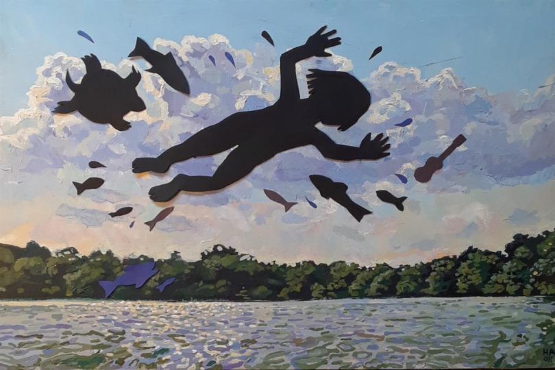
For its professional-looking strangeness. The blurb promises a one-woman show that covers a lot of ground from tornadoes to mermaids, all with live classical guitar accompaniment. On its own, I’d be skeptical of this blurb but the cover art is a detailed oil painting perfectly depicting the blurb…
What did this cover imply?
The incredible cover art promised a certain level of mastery. The painting was proof that this wasn’t the performer’s first rodeo. I expected professional storytelling with unfiltered personal expression. A show unabashedly quirky, weird, and sincere.
Did the cover deliver on its promise?
Yes. A thousand times yes. In ways I don’t understand 12 hours later. In ways I may not understand 30 years from now. In ways that I’m not sure Heidi Arneson fully understands (and after seeing this mind-twisting show) I’m not sure if fully understanding anything is even the point. Let me digress…
I’m pretty analytical by nature. When I see any show I do a lot of mental calculus; about what shows it is and isn’t similar to, whether it seems new or old, whether it says something that needs to be said right now. Watching ITCHY TINGLES I didn’t do any calculus. I didn’t think of any comparison shows or any portion of any world outside that black box theater. I was miraculously compelled to absorb every detail of what Heidi Arneson and Tony Hauser were presenting. Heidi is an adult woman and enters the stage wearing a primary-colored jumper usually reserved for seven year old girls. She presents a flawless wide-eyed sustained-talking character that had me questioning whether it was an act or actually the way she speaks on a daily basis. She told stories of her childhood in an almost-bygone but absolutely timeless style that I instinctively wanted to hear. Classical guitar master Tony Hauser accompanies throughout, which creates a surreal atmosphere that defies every description I can think of. In my notebook I wrote “I find her infinitely compelling AND I DON’T KNOW WHY” I could recant to you bits of her story or how the arc of her 60 minutes presents clips of tales and then weaves them all together in a magical way. I could tell you it’s like having your favorite aunt tell you a bedtime story you never get tired of hearing. I could tell you it feels like a style of narrative embedded in our DNA. But none of those are the reason I loved it… I loved it because it defies any description I can think of. Without a doubt, this is the most unique show I’ve seen in a long time.

Why did I choose this cover?
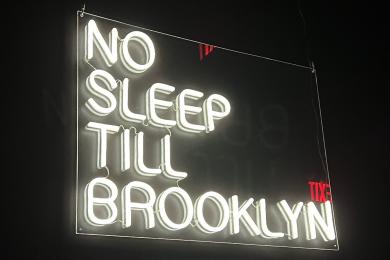
The plot description reminds me of the film “The Exterminating Angel” which I never saw but have been meaning to check out for some time. A surrealist, existentially challenging, never-ending party seems too interesting to miss.
What did this cover imply?
A Twilight Zone or Black Mirror style examination of the human condition. Also, the show’s blurb quoted rave reviews from previous productions.
Did the cover deliver on its promise?
Sort of… The plot and style were true to the expectation but (in my opinion) the show couldn’t decide if it were a comedy or a think-piece. The 60 minute show is approximately 20 laps of a three minute conversation (by way of an invisible time machine) that takes different twists and turns with each iteration. It’s easy for me to draw comparisons to episodes of Star Trek: The Next Generation or many works of playwright David Ives but that’s where the similarity needs to end. This production felt like a workshop presentation of a great piece. The chemistry between the two actors is apparent and the compositional prowess of the writer is hinted at but I have to disagree with the rave reviews cited in the blurb. Certain moments were very funny, but the promise of more laughs was never delivered. Other moments brought up the possibility of the entire piece landing on a focused Waiting for Godot style metaphor, which also never arrived. Further, simple production details were absent: the main focal point of the show is a small time machine which is described in great detail but presented in mime rather than with a physical prop (for no apparent reason). Also, a particularly funny moment states that both characters have writing on their backs (from the future). The audience preemptively laughed at this joke, at the premise of seeing the writing on their backs…but the audience never actually got to see any backs or any writing and the promised joke never arrived. This show was almost a lot of things, but wasn’t quite any of them.
In conclusion of the day, I don’t think my Kindergarten teacher was entirely right, but she wasn’t entirely wrong either. Perhaps a better phrase would be “Take book’s covers with a grain of salt.” But that’s not as fun to say. Until we figure out a better one, take some bold choices on some bold shows. Happy Fringing!


